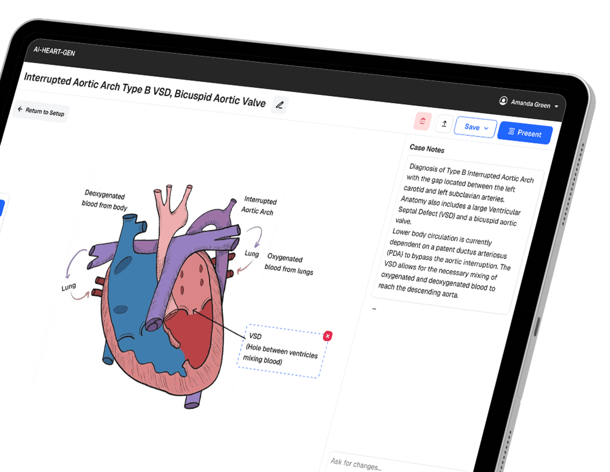
Mental Healthcare Platform for Client-Therapist Matching
I joined Rozmova at a pivotal moment—the MVP had validated market demand but struggled to convert interest into action. Built initially on no-code tools, the platform needed both a technical transformation and a design strategy focused on improving conversions and becoming a market leader by providing the best possible service for both clients and therapists.

Platform
Responsive web platform
Duration
1 year, 2 months (part-time)
My Role
Product Designer
Team
Founder, CTO, CMO, Product Manager, Product Designer, Back-end Engineer, Front-end Engineer, Community Manager/Therapist, QA
about
In 2022, Ukraine faced a mental health crisis. The ongoing war created urgent trauma care needs, yet cultural stigma and a fragmented healthcare system made accessing therapy nearly impossible.
Rozmova supports two groups whose needs are deeply connected — people seeking therapy and the specialists who provide it.
People seeking therapy
Patients face an emotionally exhausting decision. When you're anxious, depressed, or traumatized, choosing from numerous therapist profiles feels overwhelming. Many don't even understand what therapy is or how it can help—they just know they're struggling. The platform needed to educate users that it's okay to not be okay while making it easier to find the right support.
Client Job-to-be-Done
When I'm struggling with mental health and ready to seek help, I want to find a therapist I can trust who understands my context, So I can get the support I need without feeling more overwhelmed.
Therapists
Specialists want to focus on providing care but struggle with visibility and administrative chaos. Many still relied on paper notebooks to track clients. They needed a platform that brought clients to them while helping manage their growing practice.
Therapist Job-to-be-Done
When I want to grow my practice and help more people, I want clients to find me easily and tools to manage my workflow, So I can focus on providing quality care instead of admin work.
solution
Rozmova connects these two sides through a matching platform that offers flexibility in how people search for therapists, combined with educational resources that demystify therapy and reduce stigma. The platform empowers clients to find the right support while giving therapists tools to manage their practice efficiently.


Case Study 01
From Browsing to Matching: Therapist Finder Redesign
When I joined Rozmova, the platform had one way for clients to find therapists: browsing a catalog of 100+ profiles. While some users successfully booked sessions, we saw an opportunity to improve conversion rates and better serve different user needs.
Goal
Understand how people make the decision to book therapy and explore whether adding a guided questionnaire alongside the existing catalog would improve conversions.
User Interviews & Analysis
Design Solutions
User Testing
Implementation
Working with the product manager, I conducted interviews with users who had recently booked sessions. We asked participants to open the website and walk us through their actual search process, thinking aloud to capture their internal dialogue and decision-making in real-time.
Key questions
Show us how you searched for a therapist—what did you do first?
Key questions
How did you decide this therapist was the right fit for you?
Key questions
What information was most important to you?
Key questions
What made you confident enough to book?
Key Findings 01
Two distinct decision-making styles emerged
Explorers
Wanted to browse and "feel out" options before committing. Needed control over the discovery process and valued detailed profiles they could compare on their own terms.
I need to see who's available and get a sense of them first. I can't just be told who to talk to.
Decisive Seekers
Felt paralyzed by too many options. Wanted clear guidance to narrow choices quickly based on their specific needs.
I don't have energy to compare 50 therapists. I just need someone who can help with anxiety.
Key Findings 02
Users felt overwhelmed by choice
Even successful bookers described the catalog as "too much at once." Scrolling through 100+ profiles when emotionally vulnerable created anxiety rather than confidence.
I spent over an hour comparing therapists and still wasn't sure. I just picked someone who seemed nice and hoped for the best.
Key Findings 03
Nuanced needs require specific information
While common priorities included therapy type, language, and price, certain users had critical specific needs:
LGBT clients prioritized therapist experience with queer issues above everything else
War trauma survivors needed explicit confirmation of cultural sensitivity to Ukrainian military/conflict experience
Stigma-conscious users wanted clear privacy and confidentiality assurances
First-time seekers needed education on "how therapy works" before choosing
Key Findings 04
Trust signals matter more than credentials
Users valued qualifications, but what actually built confidence was:
Seeing the therapist's photo and reading their personal approach
Understanding their therapeutic style in plain language (not jargon)
Reading about specific experience with issues like theirs
Credentials are important, but what I really needed to know was: will this person understand what I'm going through?
Solution
Dual Pathways for Different Needs
Based on these insights, I designed a multi-faceted solution that addressed different user needs while building trust.
User Interviews & Analysis
Design Solutions
User Testing
Implementation
Initial Approach
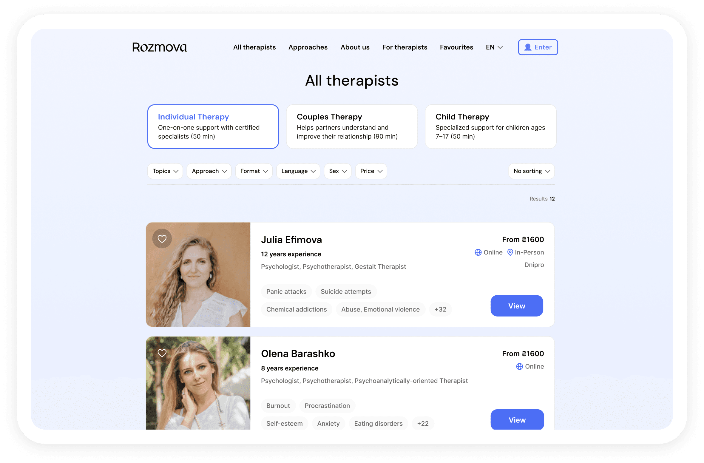
Therapist Catalog
In the first version, users explored a catalog of therapists and applied filters manually to find a match. They could sort profiles by therapy type, language, price, location, and availability. While this approach gave full control to users, it required time and effort to compare multiple profiles and identify the right fit.
New approach
Questionaire
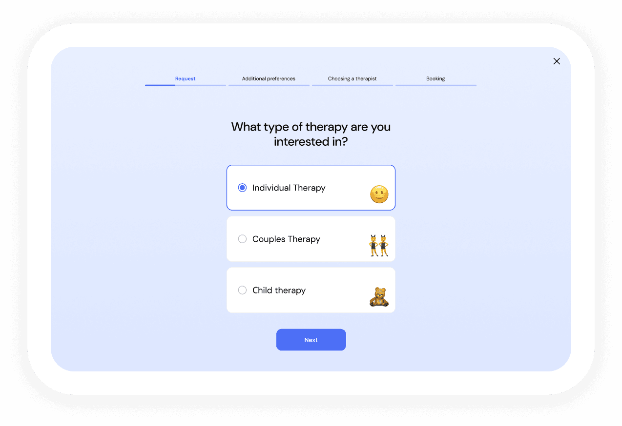
The questionnaire presented all catalog filters (therapy type, language, price, location, availability) in a focused, conversational flow, while also capturing nuanced needs like LGBT-affirming care and war trauma experience. Users received personalized therapist recommendations based on their complete profile.

New approach
Enhanced Therapist Profiles
We enriched therapist profiles to help users find a suitable and trustworthy match.

Validation
Testing the Questionnaire Design
We ran moderated sessions with 10 people who were either currently seeking therapy or had recently used the platform. During the sessions, they walked through the questionnaire while thinking aloud. Instead of focusing on metrics like completion rate or time, we observed their experience—how clear the questions felt, whether the flow seemed natural, and where they hesitated or felt uncertain.
User Interviews & Analysis
Design Solutions
User Testing
Implementation
version A
Results
Users felt rushed: "Too much at once"
The experience felt transactional: "Feels like a survey I just need to get through"
Participants often lost focus mid-page, commenting they forgot what question they were answering

version B
Results
Users felt more comfortable: "This feels like a conversation, not a form"
They took time to think: "I appreciate having space to consider each answer"
Participants engaged more thoughtfully with each question
Key insight and decision
When choosing a therapist, people want to feel unhurried. The single-question format created psychological space for reflection, making the process feel thoughtful rather than transactional—exactly what users need when making such a personal decision.
We decided to implement Single-Question Pages version. Even though it's a longer flow, the quality of engagement and user comfort mattered more than efficiency.
User Interviews & Analysis
Design Solutions
User Testing
Implementation


Impact & Results
8 weeks post-launch
Sum Up
What I'd Do Differently
Sum Up
Key Takeaways
Case Study 02
Building a Therapist-Friendly Scheduling Experience
In our MVP phase, after a client booked a session through our platform, the therapist and client would chat and manually coordinate a convenient date and time together. This worked for initial users, but at scale it became problem. New customers needed to know therapist availability before committing to book. Display therapist availability upfront so patients can book only with therapists whose schedule matches theirs—enabling true automated matching on our platform.
The Challenge
Therapist Resistance
The main challenge was behavioral, not technical. Many therapists preferred paper notebooks and resisted digital tools, seeing them as unnecessary extra work. Our goal was to motivate adoption of a workflow they didn’t initially want.
Technical Literacy Gap
A large portion of therapists had low digital proficiency. The interface had to be instantly understandable without training and feel as simple as (or simpler than) their notebook.
Existing Tools Weren’t Enough
Integrating Google Calendar wasn’t sufficient—many therapists didn’t use it or kept it for personal use only. We needed a built-in scheduling system intuitive enough for even the most analog users.
Covering Complex Scheduling Patterns
Therapists had diverse and irregular scheduling habits—from fixed weekly routines to constantly shifting availability. They also needed flexibility to manage recurring breaks, one-off events, vacations, and last-minute changes—all within one simple, unified system.
How might we
How might we create a scheduling system so simple and intuitive that even therapists who prefer paper notebooks will adopt it—while being flexible enough to handle both regular patterns and complex exceptions?
First Iteration
Slot-Based Approach
We started with a slot-based scheduling model, assuming it would offer therapists maximum flexibility to add availability piece by piece. To validate how intuitive it was, we recruited therapists for user testing and interviews to observe how they’d set their schedules and discuss their current methods. Since recruiting therapists takes effort and time, we prepared a functional prototype upfront—so participants could interact with a tangible concept and provide practical, behavior-based feedback.

Design Pivot
Availability with Subtractions Approach
Set Overall Availability + Recurring Subtractions
Therapists define their general working hours for the week and add recurring subtractions like lunch breaks or regular clients—all in one clear view.

Manage One-Time Adjustments in Calendar
Therapists can click directly on any time slot to mark it as available or busy. The action adapts to the slot’s current state, making quick adjustments effortless.

Separate Vacation Management
We limited one-time edits in the calendar to 2 weeks ahead to keep the experience simple and reduce long-term uncertainty. Since distant commitments often change or get canceled, vacations—typically planned in advance—are managed separately in a dedicated section.


Impact & Results
6 weeks post-launch